In this tutorial series part two, we are going to learn AngularJS as a server side, Bootstrap for layout styling and ASP.NET MVC as server side.
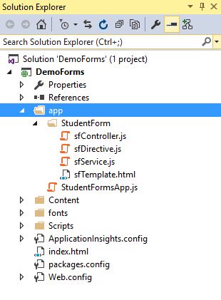
Required files/folders for this project:
For this project, we require a module name to wrap everything like controllers, services, directives. Let’s name it StudentFormsApp.js. Within this module, let’s create controllers, service, directive and view.
- Controller: Handle the data.
- Service: Get and post data from API, database, etc.
- Directive: Helps to get the form on the screen.
- View: Hold our forms, controls.
Step 1:
Create a folder named “app” and inside it lets create a JavaScript file StudentFormsApp.js which holds the module app.
Also create another folder inside app folder and name it StudentForm and inside this folder lets create following JavaScript and html files:
- sfController.js (Controller)
- sfService.js (Service)
- sfDirective.js (Directive)
- sfTemplate.html (View)
Folder structure will look like:
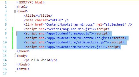
Now add all the above JavaScript files in the head of index.html.
Step 2:
Now in the StudentFormsApp.js, lets create a global variable studentFormsApp that will be the only global variable we use in the application which will be our app as module called ‘studentFormsApp’. For now, we will not specify any other dependencies so let’s put empty array ‘[]’.
In the StudentFormsApp.js put the following code:
var studentFormsApp = angular.module('studentFormsApp', []);Step 3:
In the controller, we take the global variable ‘studentFormsApp’ and call the ‘controller’ method which enables to create an angular controller. Let’s name is sfController. Next, lets create function sfController() controller with $socpe as variable and sfService as service reference. We get the data from sfService and set it to $scope.student variable.
In sfController.js put the following code:
studentFormsApp.controller('sfController',
    function sfController($scope, sfService) {
       $scope.student = sfService.student;
});
Step 4:
In the service (sfService), we take the global variable ‘studentFormsApp’ and call the ‘factory’ method which creates the service (sfService) and pass a function that returns data. For now, I am using sample data.
In sfService.js following is the code snippet:
studentFormsApp.factory('sfService',
    function () {
        return {
            student: {
                fullName: "Kishor Bikram Oli",
                objective: "To become a great software engineer",
                level: "Undergraduate",
                isAvailable: true,
                isOnline: true,
                status: "none"
            }
        }
    });
Here data is returned as object with key value. So ‘student’ is pulled as sfService.student in controller like:
$scope.student = sfService.student;Step 5:
Now in index.html, lets add an attribute ‘ng-app’ named “studentFormsApp” in the html tag.
Add the ng-controller = “sfController” in the body tag.
To show our form, lets create a “student-form” directive. We can directly call this <student-form/> tag from our directive.
In index.html, following code snippet:
<!DOCTYPE html>
<html ng-app="studentFormsApp">
<head>
    <title></title>
    <meta charset="utf-8" />
    <link href="Content/bootstrap.min.css" rel="stylesheet" />
    <script src="Scripts/angular.min.js"></script>
    <script src="app/StudentFormsApp.js"></script>
    <script src="app/StudentForm/sfController.js"></script>
    <script src="app/StudentForm/sfDirective.js"></script>
    <script src="app/StudentForm/sfService.js"></script>
</head>
<body ng-controller="sfController" class="container">
    <br/>
    <student-form/>
</body>
</html>
Step 6:
In the sfDirective.js, we take our global app object “studentFormsApp” and call directive method to create a directive.
We are passing the “studentForm” as the name of directive. Here “studentForm” is in camel case (starting with lower case and next word begins with upper case).
This will be translated into snake-case that is “student-form”. Notice that, this is same in index.html as <student-form/>
We are also passing a function which returns an object with two items: restrict and templateUrl for our html file.
In sfDirective.js, following is the code snippet:
studentFormsApp.directive('studentForm',
    function () {
        return {
            restrict: 'E',
            templateUrl: 'app/StudentForm/sfTemplate.html'
        }
    });
Step 7:
Now in sfTemplate.html, we add a form with different controls that is required for a student form. We are styling this with bootstrap controls.
- Input field
- Labels
- Check Box
- Select Box
- Radio Button
- Submit Button
Here, we have used bootstrap to style our forms. So following classes are used for controls:
- container: adds margin and center page content (We have used this class in body of index.html).
- form-group: groups a label and input field.
- form-control: placed on input elements.
These bootstrap classes help to provide responsiveness for different device resolutions.
Complete code snippet for sfTemplate.html is:
<form role="form">
    <div class="form-group">
        <label for="fullName">Name</label>
        <input type="text" id="fullName" class="form-control" />
    </div>
    <div class="form-group">
        <label for="objective">Objective</label>
        <textarea name="objective" id="objective" class="form-control" rows="5" cols="40"></textarea>
    </div>

    <div class="form-group">
        <label for="department">Department</label>
        <select name="department" id="department" class="form-control">
            <option>Math</option>
            <option>Physics</option>
            <option>Chemistry</option>
            <option>English</option>
        </select>
    </div>
    <br />

    <span><b>Hobbies</b></span><br />
    <div class="checkbox">
        <label><input type="checkbox" value="hobbiesTravel" />Travelling</label>
    </div>
    <div class="checkbox">
        <label><input type="checkbox" value="hobbiesPhotography" />Photography</label>
    </div>
    <div class="checkbox">
        <label><input type="checkbox" value="hobbiesGaming" />Gaming</label>
    </div>
    <br />

    <span><b>Gender</b></span><br />
    <div class="radio">
        <label><input type="radio" name="gender" value="male" /> Male</label><br />
    </div>
    <div class="radio">
        <label><input type="radio" name="gender" value="female" /> Female</label><br />
    </div>
    <br />

    <input type="submit" class="btn btn-primary" value="Submit" />
</form>
Step 8:
Run the application and the following output will be displayed:

Step 9:
More Bootstrapping:
form-horizontal: places labels to the left of the controls.
control-label: groups a label.
col-sm-3 col-sm-9 use the 12-column grid.
Let’s add a class ‘form-horizontal’ in the form tag. Add class ‘col-sm-3 control-label’ in label controls. Add class ‘form-control’ in input fields.
Wrap input field with div. Include this class ‘col-sm-9’ that makes 12 column grids. Here ‘sm’ stands for small.
So, it will look like:
<div class="form-group">
    <label for="fullName" class="col-sm-3 control-label">Name</label>
    <div class="col-sm-9">
        <input type="text" id="fullName" class="form-control" />
    </div>
</div>
This will help us to make horizontal responsiveness even in smaller devices.
Complete code snippet of the new sfTemplate.html:
<form role="form" class="form-horizontal">
    <div class="form-group">
        <label for="fullName" class="col-sm-3 control-label">Name</label>
        <div class="col-sm-9">
            <input type="text" id="fullName" class="form-control" />
        </div>
    </div>
    <div class="form-group">
        <label for="objective" class="col-sm-3 control-label">Objective</label>
        <div class="col-sm-9">
            <textarea name="objective" id="objective" class="form-control" rows="5" cols="40"></textarea>
        </div>
    </div>

    <div class="form-group">
        <label for="department" class="col-sm-3 control-label">Department</label>
        <div class="col-sm-9">
            <select name="department" id="department" class="form-control">
                <option>Math</option>
                <option>Physics</option>
                <option>Chemistry</option>
                <option>English</option>
            </select>
        </div>
    </div>
    <br />
    <div class="form-group">
        <div class="col-sm-3">

        </div>
        <div class="col-sm-9">
            <span><b>Hobbies</b></span><br />
            <div class="checkbox">
                <label><input type="checkbox" value="hobbiesTravel" />Travelling</label>
            </div>
            <div class="checkbox">
                <label><input type="checkbox" value="hobbiesPhotography" />Photography</label>
            </div>
            <div class="checkbox">
                <label><input type="checkbox" value="hobbiesGaming" />Gaming</label>
            </div>
            <br />
        </div>
    </div>

    <div class="form-group">
        <div class="col-sm-3"></div>
        <div class="col-sm-9">
            <span><b>Gender</b></span><br />
            <div class="radio">
                <label><input type="radio" name="gender" value="male" /> Male</label><br />
            </div>
            <div class="radio">
                <label><input type="radio" name="gender" value="female" /> Female</label><br />
            </div>
            <br />

            <input type="submit" class="btn btn-primary" value="Submit" />
        </div>
    </div>
</form>
Run the app, form will be displayed as below:

Step 10:
Working with fieldsets:
fieldsets helps grouping of controls together. It has legend tag that gives name to fieldset.
Let’s add fieldsets to group our controls along with legend to give them a name. So, updated html will look like:
Updated code for sfTemplate that includes fieldsets:
<form role="form" class="form-horizontal">
    <fieldset>
        <legend>Basic Information</legend>
        <div class="form-group">
            <label for="fullName" class="col-sm-3 control-label">Name</label>
            <div class="col-sm-9">
                <input type="text" id="fullName" class="form-control" />
            </div>
        </div>
        <div class="form-group">
            <label for="objective" class="col-sm-3 control-label">Objective</label>
            <div class="col-sm-9">
                <textarea name="objective" id="objective" class="form-control" rows="5" cols="40"></textarea>
            </div>
        </div>

        <div class="form-group">
            <label for="department" class="col-sm-3 control-label">Department</label>
            <div class="col-sm-9">
                <select name="department" id="department" class="form-control">
                    <option>Math</option>
                    <option>Physics</option>
                    <option>Chemistry</option>
                    <option>English</option>
                </select>
            </div>
        </div>
    </fieldset>
    <br />

    <fieldset>
        <legend>Hobbies</legend>
        <div class="form-group">
            <div class="col-sm-3">

            </div>
            <div class="col-sm-9">
                <div class="checkbox">
                    <label><input type="checkbox" value="hobbiesTravel" />Travelling</label>
                </div>
                <div class="checkbox">
                    <label><input type="checkbox" value="hobbiesPhotography" />Photography</label>
                </div>
                <div class="checkbox">
                    <label><input type="checkbox" value="hobbiesGaming" />Gaming</label>
                </div>
                <br />
            </div>
        </div>
    </fieldset>

    <fieldset>
        <legend>Gender</legend>
        <div class="form-group">
            <div class="col-sm-3"></div>
            <div class="col-sm-9">
                <div class="radio">
                    <label><input type="radio" name="gender" value="male" /> Male</label><br />
                </div>
                <div class="radio">
                    <label><input type="radio" name="gender" value="female" /> Female</label><br />
                </div>
                <br />
            </div>
        </div>
    </fieldset>
    <input type="submit" class="btn btn-primary col-sm-offset-3" value="Submit" />
</form>
Step 11:
Run the application, you will see the following UI with groupings and headings:

In this article, we have learnt about angular structure, routing, bootstrap styling. We will learn more about AngularJS, bootstrap and of course ASP.NET-MVC in the next articles.
Get the project from GitHub: https://github.com/geekishor/StudentFormsDemoApp-AngularJS-Bootstrap-ASP-NET-MVC
Keep you posted.
Thanks, Happy Coding!